Naval Postgraduate School OC3902
FUNDAMENTALS OF MAPPING, CHARTING, AND GEODESY
|
Lab4: ArcGIS Part-2 Lab Exercise |
|
The ESRI Shapefile or
simply a shapefile is a popular geospatial vector data format for geographic
information systems software. It is developed and regulated by ESRI as a
(mostly) open specification for data interoperability among ESRI and other
software products. A "shapefile" commonly refers to a collection of
files with ".shp", ".shx",
".dbf", and other extensions
on a common prefix name (e.g., "lakes.*").
The actual shapefile relates specifically to files with the ".shp"
extension, however this file alone is incomplete for distribution, as the
other supporting files are required. This lab will practice how to map from shapefile data and how to use
layout view to represent a piece of paper with several maps. There are three Please copy the directory lab4_ArcGIS2 with all the data files to your working directory from \\lrcapps\common$\OC3902\FY09Qtr1, and work in your own directory. |
|
|
|
|
|
|
|
|||
|
|
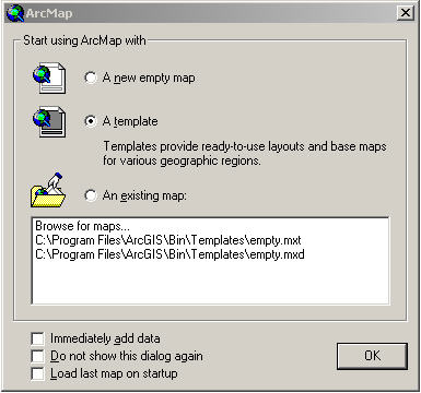
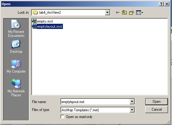
Start ArcMap, check “A template”.
Change the director to lab4_ArcView2
Select “emptylayout.mxt”.
Then click “Ok”. Now you get an empty layout view map. Switch ‘layout view’ to ‘data view’.
|
|
|||
|
Step 2 |
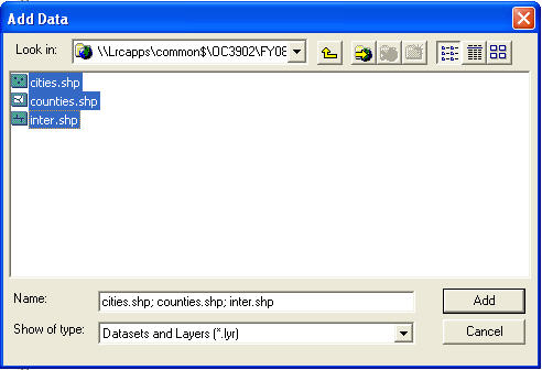
Add the shapefile data |
|
|||
|
|
Click the
Click Add. |
|
|||
|
|
|
|
|||
|
|
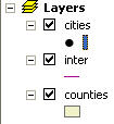
Change the right city symbol (circle1) and size (8) the same way as the last lab.
|
|
|||
|
|
|
|
|||
|
|
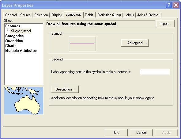
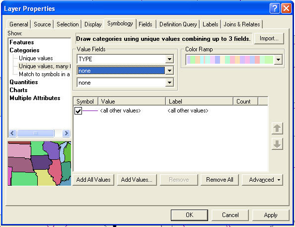
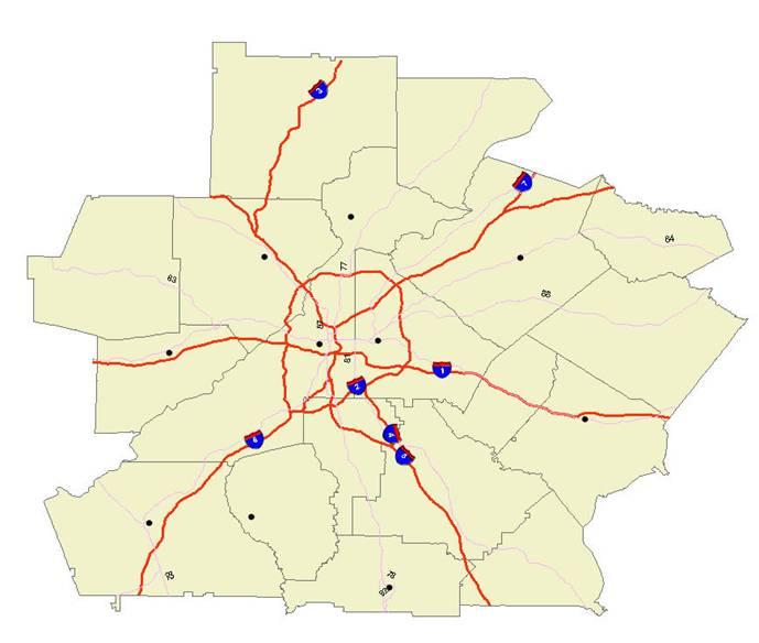
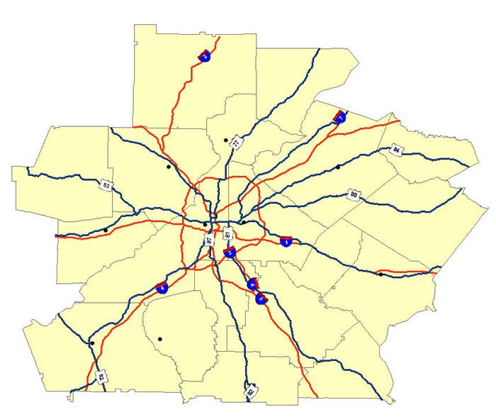
Different line styles: Right click on “inter”,
Choose “Categories”, then click “Unique values many fields”, pull down value filed to “TYPE” and leave the other two line <NONE>.
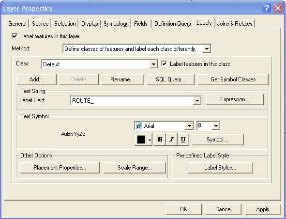
Click “Add All Values” (or click “Add Values…” select both “interstate” and “US”). Change the property from “Symbology” to “Labels” and check on “Label features in this layer”, change the method to “Defined classes of features and label each class differently.”.
Click “Get Symbol Classes” and pull
down to “Interstate” on Class and pull down to “ROUTE_ID” in Label Field.
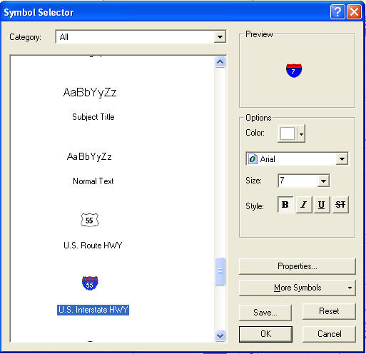
Click on “Symbol’ and select “
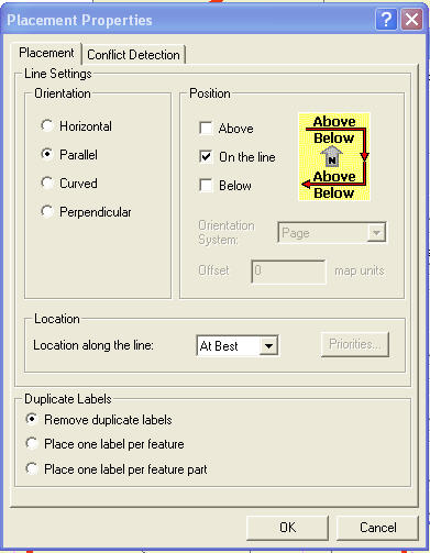
Click “OK” and click “Placement Properties…” on “Other Options”. In the Placement properties Catalog select Orientation as “Parallel”, and Position as “On the line”.
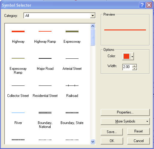
Click “OK”. Switch the Layer Property from “Labels” to “Symbology” in Laper Properties Catalog. Double click “Interstate” and change Symbol selector to “Highway”, color as red and width as 2.
Click “OK” both in symbol selector and layer properties.
Same way to modify U.S.Hwy symbol, size and placement properties.
|
|
|||
|
|
|
|
|||
|
|
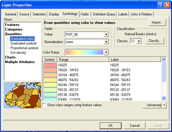
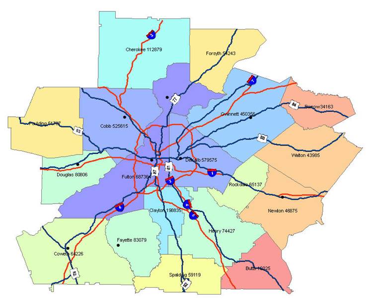
Right click on “counties”, click “Properties…”, click “Symbology”, in the Layer Properties Catalog and select “Quantities” and “Graduated Colors”, in the “Values” of field choice “POP_98” and leave <NONE> in Normalization, choice the classes number and color ramp.
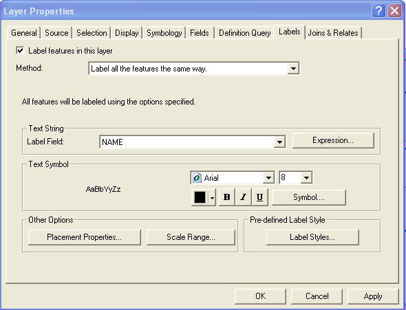
Click “Labels”, mark “Label features in this layer”.
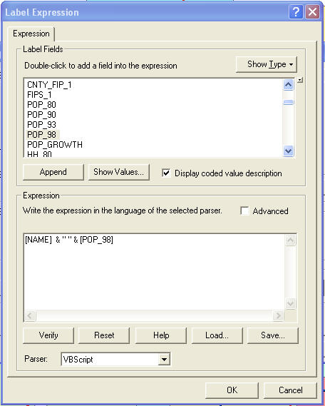
If you want add both “NAME” and “POP_98” in label fields, click “Expression” instead of selection. Pull down to “POP_98” click Append in the Label Expression Catalog.
Click “OK” in both Label Expression window and Layer Properties window. Now you can get map as:
If you like to add a round brackets on population number, you can modify the expression [NAME] & " " & "("&[POP_98] &")" in the Label Expression Catalog. |
|
|||
|
|
|
|
|||
|
|
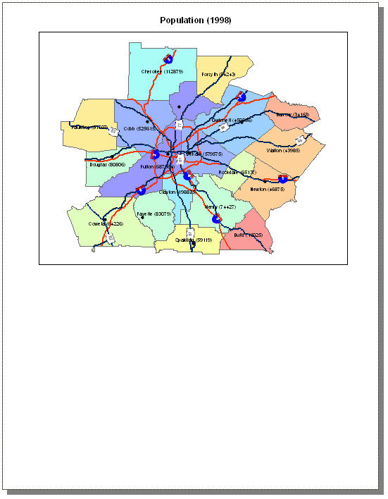
Click “layout view”, change the map size and move it to the upper half of the paper. Add text Population (1998) as the map title (use Drawing tool bar).
|
|
|||
|
|
|
|
|||
|
|
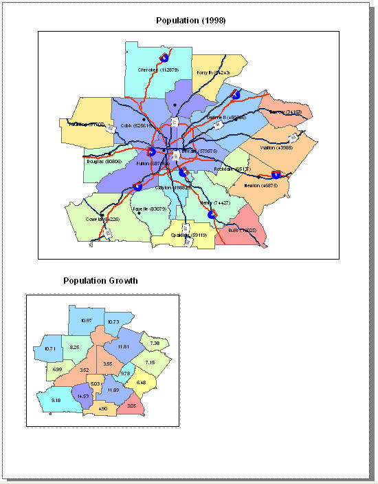
Click “Insert” in main menu, click “Data frame”, move the frame and re size it, to the right position. Click add data ‘symbol’ in standard tool bar, only select “counties.shp”. Use layer properties to make the POP_GROWTH map with label on. Make the title as “Population Growth”.
|
|
|||
|
|
|
||||
|
|
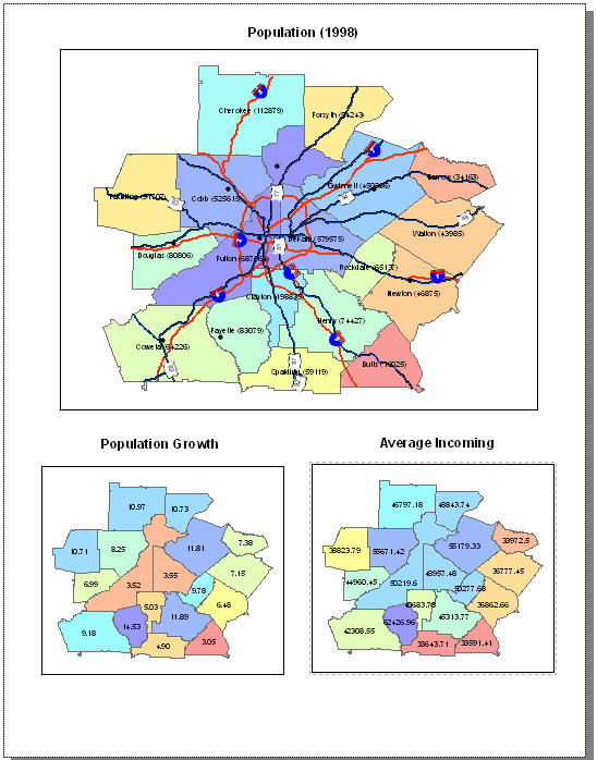
Similar to the step 7
|
|
|||
|
|
|
||||
|
|
Pull down to “Save As” from File in main bar, save the map as lab2.mxd. |
|
|||
|
Pull down to “Export Map…” from File in main bar, save the map as lab2.gif. |
|
||||
|
|
|
|
|
||
Email lab2.gif to: fan@nps.edu
(Back to "Labs List" page.)
Last Updated 29 Sep. 2008
POC: Peter Chu